 Busirank Team
Introduction
More than 65% of all web searches and over 80% of local “near me” business queries happen on a smartphone. Recognizing this fundamental shift in human behavior, Google fully transitioned to mobile-first indexing for 100% of the web.
This means Googlebot crawls, renders, evaluates, and ranks your website exclusively based on its mobile version — not what your website looks like on a desktop monitor.
If your desktop site looks pristine but your mobile experience is slow, missing key content, or difficult to navigate with a thumb, your search rankings will suffer across both desktop and mobile search results.
In this guide, you will learn exactly how mobile-first SEO works, the essential technical requirements to pass Google’s mobile evaluation, and actionable steps to turn mobile visitors into paying customers.
What Is Mobile-First Indexing?
Mobile-first indexing means Google uses the mobile version of your page’s content for indexing and ranking.
Historically, Google crawled the desktop version of a site to determine its relevance for search queries, using the mobile version solely for mobile-specific queries. Today, Googlebot uses a mobile smartphone user-agent to crawl your entire website.
What Mobile-First Indexing Does NOT Mean:
- It is not a separate mobile index: There is only one single Google index. Google populates that index using mobile page renders.
- It does not mean desktop is completely ignored: Desktop users still see desktop layouts, but Google calculates your ranking signals primarily from your mobile page structure, content, and metadata.
If your desktop site contains 2,000 words of rich topical content, structured data, and customer reviews, but your mobile site hides that content behind “Read More” accordions or strips it out to reduce file sizes, Google will assess your page based on what is accessible on mobile.
Why Mobile-First SEO Matters for Local Businesses
For local businesses, mobile optimization is not just a search ranking factor — it is your primary revenue engine.
- Immediate Buyer Intent: When consumers search for a local plumber, restaurant, dental clinic, or auto mechanic on a phone, they are usually looking to call immediately or get driving directions within the hour.
- Direct Connection to Google Business Profile: Google Maps search results seamlessly link your Google Business Profile to your mobile landing page. A slow or broken mobile landing page leads to immediate bounces.
- Core Web Vitals Impact: Google measures Core Web Vitals in real-world conditions. Because mobile networks experience fluctuating latency, poor mobile performance heavily penalizes your user experience score.
Core Pillars of Mobile-First Optimization
To ensure your website succeeds under mobile-first indexing, focus on these five core pillars:
1. Parity Between Desktop and Mobile Content
Ensure your mobile site has identical content, metadata, and structured data as your desktop site:
- Headings & Body Copy: Do not truncate important sections or remove explanatory paragraphs on mobile.
- Page Titles and Meta Descriptions: Ensure mobile pages serve identical descriptive title tags and meta descriptions.
- Schema Markup: Ensure JSON-LD structured data (such as
LocalBusiness,Product, orArticleschemas) is included in the mobile HTML payload. - Images and Alt Text: Maintain high-quality images with descriptive alt text on both devices.
2. Responsive Viewport and Fluid Layouts
Never use a separate m.domain.com subdomain if you can avoid it. Responsive web design with standard viewport meta tags is Google’s official recommended best practice:
<meta name="viewport" content="width=device-width, initial-scale=1, maximum-scale=5" />Ensure your layout dynamically adapts using CSS media queries, flexbox, and modern grid systems, preventing horizontal scrolling or off-screen elements.
3. Tap Targets and Thumb Accessibility
Mobile users navigate with thumbs, not precision mouse pointers:
- Interactive Button Sizing: Buttons and links must be at least 48x48 CSS pixels in size.
- Spacing: Provide at least 8px of padding between clickable elements to prevent accidental miss-clicks.
- Form Inputs: Input fields should have a minimum font size of 16px to prevent iOS Safari from automatically zooming in when users tap a text field.
4. Mobile Page Speed and Resource Delivery
Mobile devices possess less CPU processing power than desktop workstations and often operate on variable 4G/5G connections:
- Modern Image Formats: Convert all PNGs and JPEGs to modern WebP or AVIF formats. See our detailed guide on image SEO optimization.
- Defer Non-Critical JavaScript: Avoid heavy third-party tracking scripts that block the main thread.
- Eliminate Render-Blocking Resources: Inline critical CSS and load secondary stylesheets asynchronously.
5. Clear Local Conversion Triggers
On mobile, your primary conversion triggers must be immediately visible without excessive scrolling:
- Click-to-Call Phone Numbers: Wrap phone numbers in
tel:links so users can dial in a single tap:<a href="tel:+1234567890">Call Now</a>. - Directions & Location Maps: Embed clean address citations and direct Google Maps navigation links.
- Instant Booking / Action Buttons: Sticky header or bottom navigation bars with direct CTAs increase mobile conversion rates by up to 35%.
Common Mobile SEO Mistakes to Avoid
| Mistake | Impact | Corrective Action |
|---|---|---|
| Hiding content on mobile | Google drops topical relevance for hidden sections | Keep all core educational and service content identical |
| Intrusive mobile popups & interstitials | Violates Google’s interstitial guidelines; causes instant exits | Use modest banners that take up less than 20% of the screen |
| Missing structured data on mobile | Loses rich snippets in search results | Deploy JSON-LD globally in server-rendered templates |
| Unplayable video or audio formats | Frustrates users and increases bounce rate | Use HTML5 standard <video> and <audio> tags |
| Disallowing CSS or JavaScript in robots.txt | Googlebot cannot render the mobile layout properly | Ensure all style and script assets are fully crawlable |
Step-by-Step Mobile SEO Audit Checklist
Follow this checklist to audit your site’s mobile readiness:
- Test with Google Search Console: Review the “Page Indexing” and “Core Web Vitals” reports under Search Console to inspect any mobile-specific indexing hurdles.
- Verify Mobile Rendering: Use Google’s URL Inspection tool to view the “Crawled Page > Screenshot” and confirm Googlebot renders your full page layout without missing blocks.
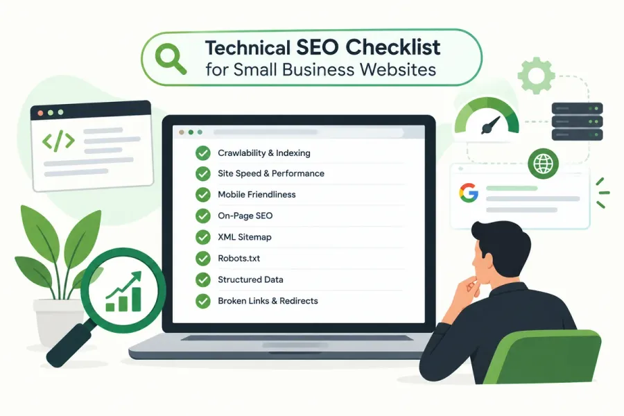
- Check Internal Links: Verify your mobile navigation menu contains functional links to your pillar pages and guides, as outlined in our technical SEO checklist and website architecture guide.
- Audit Your Local Profile: Use our Free GBP Audit Tool to verify that your Google Business Profile links directly to your mobile-optimized landing page.
FAQs
What is the difference between mobile-friendly and mobile-first indexing?
Mobile-friendly refers to whether a human user can comfortably view and navigate your website on a phone without pinch-zooming. Mobile-first indexing refers to how Google’s search algorithms crawl and index your pages: Google uses the mobile smartphone version of your content as the primary basis for ranking your website in all search results.
Does mobile-first indexing affect desktop search rankings?
Yes. Google has a single unified index. Even when a user searches on a desktop computer, Google ranks pages based on the evaluation gathered from crawling the mobile version of your site.
Can I have a separate desktop and mobile site?
While separate mobile sites (like m.yoursite.com) are technically supported, Google strongly recommends responsive web design. Separate mobile sites frequently suffer from content discrepancies, broken cross-links, and canonical confusion.
How do Core Web Vitals influence mobile SEO?
Google measures real-world user metrics on mobile devices, including Largest Contentful Paint (LCP), Interaction to Next Paint (INP), and Cumulative Layout Shift (CLS). Passing all three Core Web Vitals provides a direct ranking boost in mobile search results and prevents user frustration.
Keep Reading
Grow Your Google Maps Ranking on Autopilot
Stop spending hours every week manually replying to customer reviews and writing Google posts. Busirank automates your Google Business Profile to boost your local SEO rankings and turn searchers into paying clients.
 Busirank Team